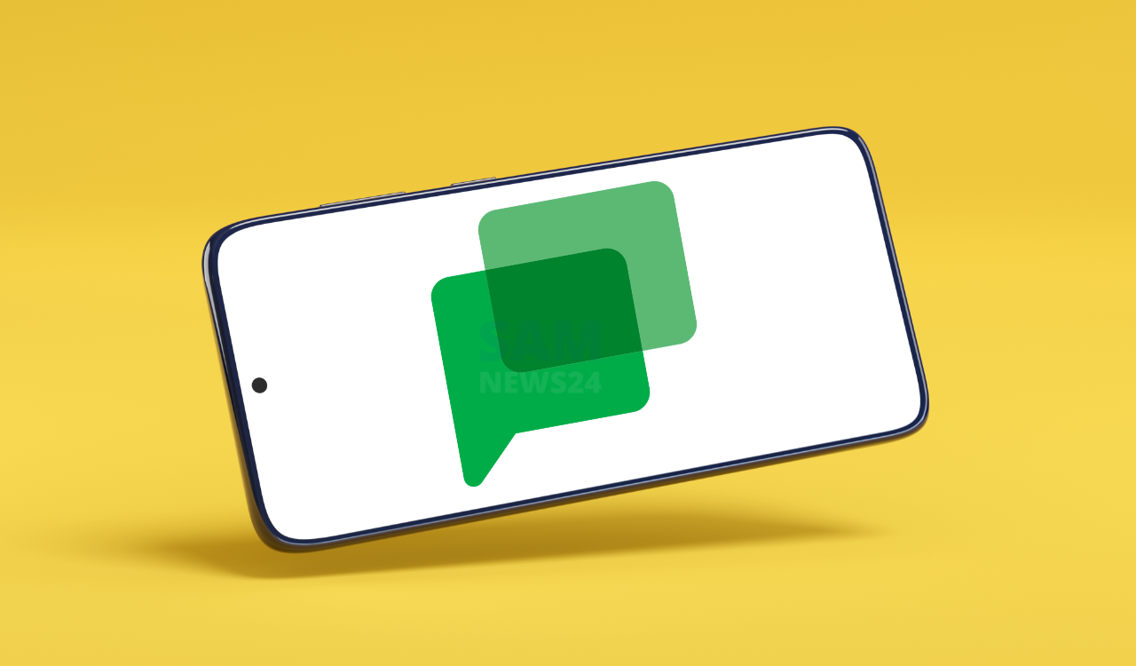
Google gives a recent update on its official blog, introducing a more consistent, enhanced look and feel for Google Chat…..!! Following Gmail, Drive, and Docs/Sheets/Slides, Google Chat is now the latest Workspace web app to get a Material You redesign.
In an update, there are two to this redesign, the light blue background accommodating mainly all and the actual conversation thread, which remains white. Google touts “updated font, colors, layouts, panel sizing, and more.” There’s also a pill-shaped search field at the top, well this become a common enough update that Google did in almost all recent updates.
Notably, changes could be easy to get your attention to the top app bar, left navigation, main message view, compose setup, new topic button, and the threaded panel within direct messages and spaces.
- This Material You redesigned for Google Chat on the web is rolling out now and will be fully available over the coming weeks:
- Available to all Google Workspace customers, as well as legacy G Suite Basic and Business customers
Available to users with personal Google Accounts
On July 5, users got the reminders that Google Currents (Google+ for businesses) is shutting down. Spaces, which support up to 8,000 people, in Google Chat are the intended replacement, with Google continuing its rollout of “community” features. This includes the ability to set Space as an announcements channel. Other capabilities listed as “coming soon” include:
- Post-view metrics: Discovery and connection
- Full Chat API: Apps and workflow integration
- Google Groups sync with spaces for membership management
- Space management tools in Admin Console

FOLLOW US ON SOCIAL MEDIA – Telegram, Twitter, Facebook, & Google News.