
So, the saga continues, ‘Material You’ have yet not done after redesigning the Google Account switcher on the web and then Google News App ‘Material You’ redesign on tablets. You can read us we have published chronicles on the same. Now, the ‘Material You’ redesigned the address bar in Chrome for Android.
Read by here:
-
Material You redesign for the Google Account switcher on the web
-
Find My Device finally gets a Material You redesign along with dark theme
Chrome for Android is now rolling out a Material You address bar redesign that adds more Dynamic Color. Google started testing an “Omnibox Modernize Visual Update” to revamp a core part of the mobile browser, back in September.
After an update, you’ll see Chrome’s address bar is no longer housed in the same pill-shaped container that’s seen when the field isn’t active once when tapping on the Omnibox. This new shape is slightly taller, more rectangular, and in line with Material You.
This redesign introduces much more Dynamic Color than before (text and Omnibox only). While the borders help make the page appear less crowded with not too significant an impact on how much text appears. The search results, websites, and other suggestions are no more there. Which used appears below. It’s just text on a light/dark background. Rather, each is now housed in a card that has a lighter background than the rest of the screen.
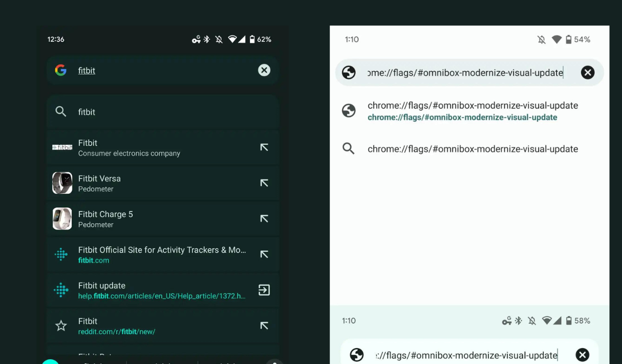

After appearing in the beta channel at the end of last year, we’re now seeing this address bar redesign in the stable channel with Chrome 109, though it’s a server-side update. All but one of our devices today has this new look, while we’ve yet to encounter it naturally on tablets.
As per the source, it may not be live yet for you, use the flag:
- chrome://flags/#omnibox-modernize-visual-update.
This design is quite reminiscent of the unified Pixel Launcher search and brings that experience over to non-Google phones. Hope you like the content. Read more updates, news, and pieces of information on @Samnews24…