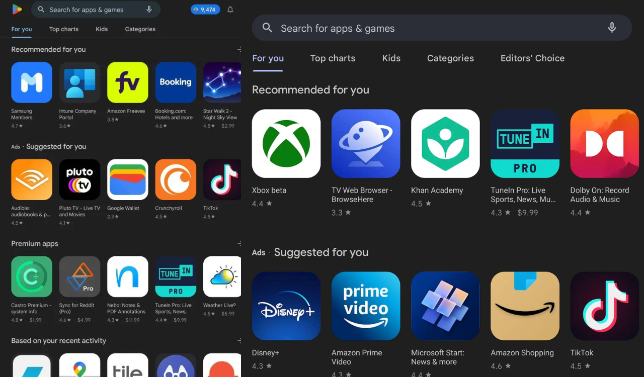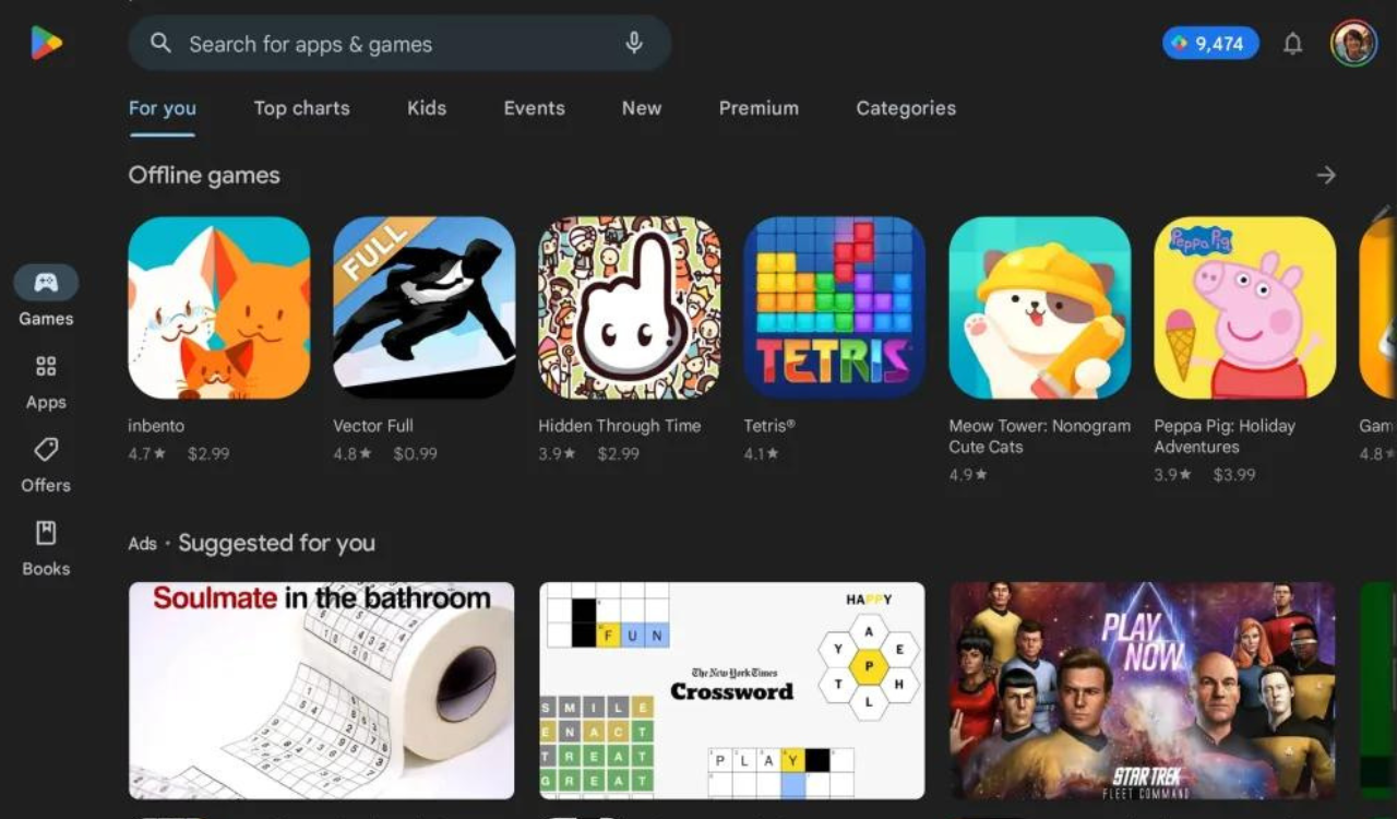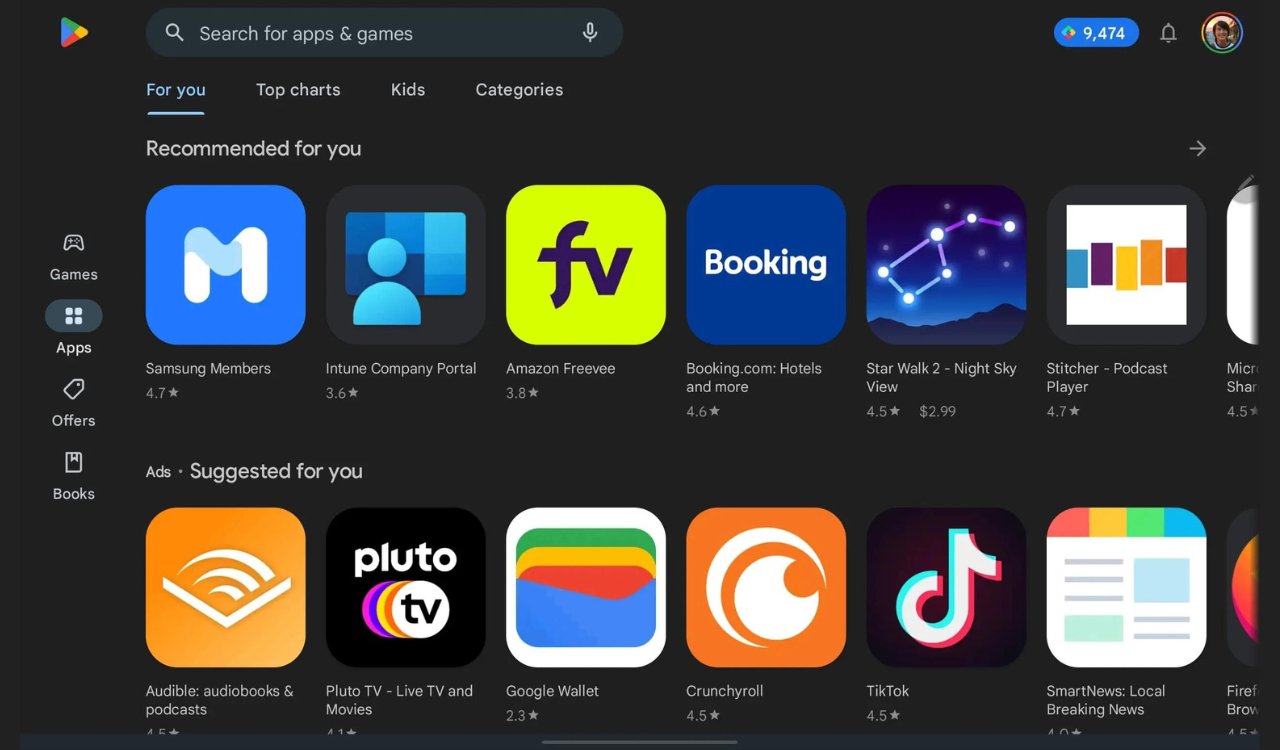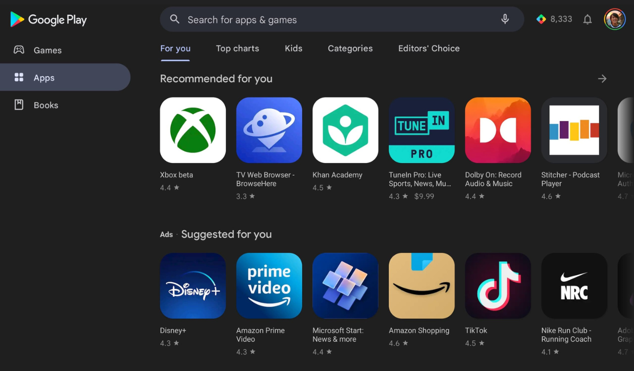
Google has now started rolling a new UI for the Play Store for tablets and Google is kicking off the redesign with a navigation rail.
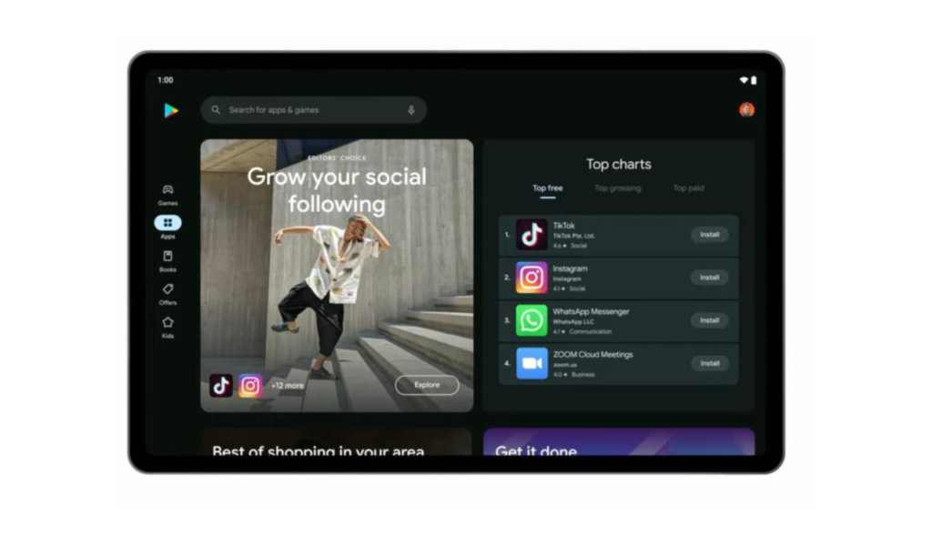
In the last layout, you were getting the always-visible navigation drawer at the left, while the store logo was followed by “Google Play” above it. Now the company has done some tweaks to it.
In the new design UI, you just get the Google Play Store icon in the top-left corner, while a navigation rail with a pill-shaped active indicator is leveraged. Now, the Google search box is narrower as Play Points, notifications, and profile avatar remain on the right.
For your information, the latest changes will be seen in version 32.5.16-21 of Google Play on Android tablets. It’s not appearing on Chromebooks yet.