This article basically refers to the users who want to do a comparative analysis between Samsung One UI 3.0 and One UI 4.0. Though each updated UI comes with additional features, Here in this article, we try to cover all major aspects which differentiate both UI from each other. Apart from this we also give a quick taste to the user on the basis of the functionality of each.
So before going into depth, there’s little about the two.
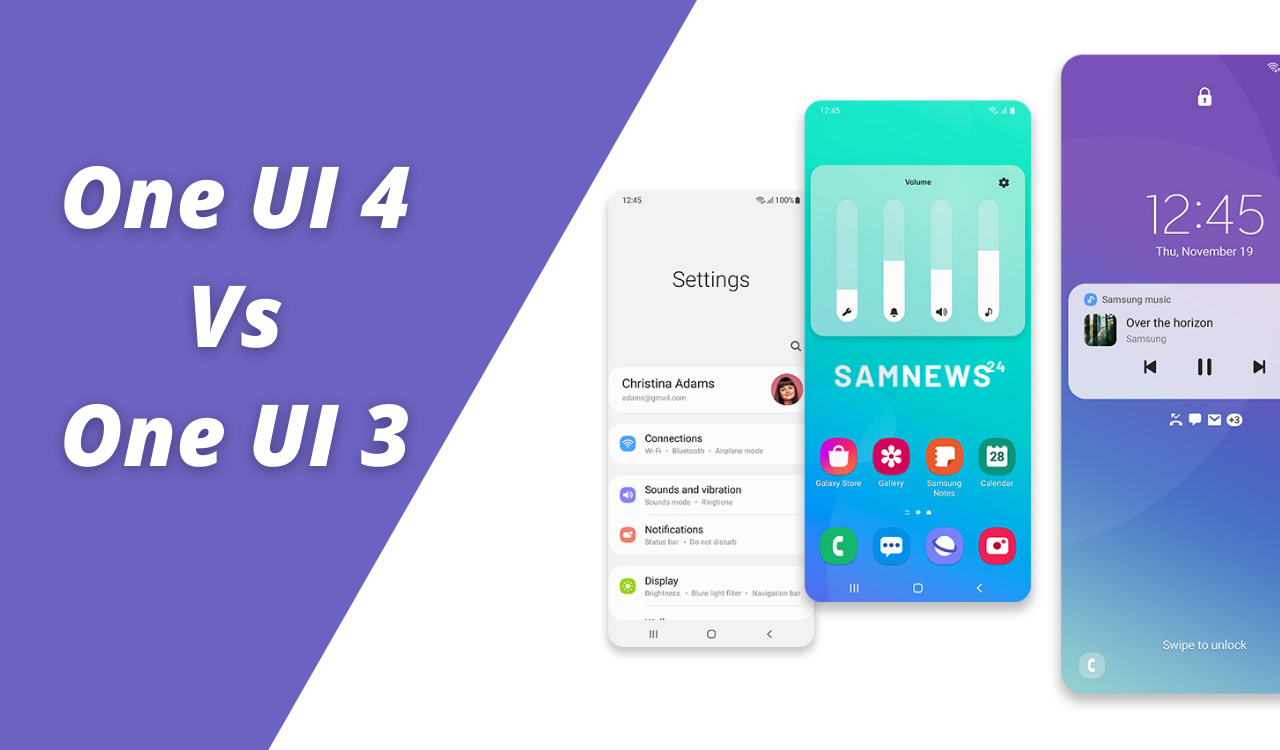
One UI 3.0
It is based on top of Android 11 and was released for Galaxy S20 devices beginning December 2, 2020, it brings noteworthy update revisions including a translucent notification panel, new volume controls positioned on the right or left of the device alongside the physical volume keys, slightly enhanced widgets, and smoother animations and transitions throughout the whole UI.
One UI 4.0
It is based on Android 12, and it is the fourth generation of One UI. It was released to the Galaxy S21 Series on November 16, 2021. One UI 4 focuses on customization, privacy, and access to Samsung’s expanding ecosystem.
Samsung One UI 4.0: Hands-on with new features for Android 12 which differ it from One UI 3.0
In line with Android 12, One UI 4.0 primarily focuses on customization for the majority of its changes. And this time they give updates extensively for privacy and device care.
Compared to One UI 3.1, the One UI 4.0 upgrade comes with new customization options, privacy features, nifty design changes, and a lot more.
The most visible change to One UI 4 is the customization options for both the home screen and lock screen. Starting with the Home screen, widgets are updated with a new and refreshing look that aligns with Android 12’s Material You redesign.
Widgets are flatter with a little rounder appearance, along with some widgets, such as the dual clock now changes from light to dark mode depending on the time of day. Unlike Material You, these widgets will not adapt the color of their background.
Dark Mode
Talking about the dark mode, Samsung made a subtle change here for a slightly more smooth experience. Icons, wallpapers, and certain text fields are now a little dimmed when in dark mode. Though, everyone does not a liking it as a change. So many of us kept turning up the brightness when in dark mode. The reason behind why Samsung made this change is to make the experience a little easier on the eyes, compared to the old method of a dark mode on One UI 3.0.
UI enhancement
As with every One UI upgrade, Samsung has again added some design changes to the UI for enhanced user experience. First of all, the overall UI is now smoother and faster.
Color Themes
Similar to Android 12, Samsung has introduced color themes in One UI 4.0 in which the OS extracts color pallets from the wallpaper. You can choose between the color themes that will apply to the entire UI.
Notifications
Similar to One UI 3’s Samsung placed a big focus on notifications this time also; however, this time there are not many changes. Notifications are slightly condensed, and the background in both light and dark mode is less transparent whereas Quick Settings tiles look almost identical to One UI 3 but are slightly more concise. The brightness slider is now larger for easier access while holding devices one-handed.
AOD
Coming to Always-on display or AOD, there are new animation stickers. You can set AOD to only awake when you receive a notification.
Camera and Gallery
Coming to the Camera and Gallery app then One UI 4.0 introduces numerous changes. Out of many, one very visible change is that you can touch and hold the shutter button to start recording a video in Photo mode. other than this you can also drag your finger to the lock icon to keep recording.
While scanning a document, you can now zoom in to edit the document.
Additional updates
Again talking about specific updates then this is relatively small compared to Android 12’s overall updates. There are a few other add-on updates that we noticed:
- One UI 4 gets new charging animations. They look clean and give a modern feel compared to One UI 3’s animations.
- Picture and Picture and multitasking windows sport rounded corners instead of square ones.
- Device care features a new “Protect battery” option that allows users to limit the maximum charge to 85% in an attempt to conserve long-term battery life.
- AR emoji can be set as contact photos.